Reusable UI widgets for AI dashboards and SaaS products
Build Real AI and SaaS Products Faster with Production-Ready Widget System
A scalable library of system-driven UI widgets designed for AI dashboards, admin panels, analytics tools, and internal platforms. Built with Auto Layout 5.0, semantic tokens, and consistent interaction patterns for production use.


Built as a Production System, Not a UI Pack
AI & SaaS Widgets is a production-ready component system designed for dashboards, admin panels, analytics tools, and AI-driven products.
It’s built for designers and teams who need consistency, scalability, and speed without sacrificing structure or clarity.
The system includes essential UI components and advanced widgets used in real SaaS products, all built with Auto Layout 5.0, responsive variants, and clean naming that scales with your product.
Your Core SaaS UI Building Blocks
This system includes the essential UI components used across modern SaaS dashboards and admin interfaces. Buttons, inputs, dropdowns, checkboxes, radios, badges, breadcrumbs, tabs, pagination, tables, tooltips, alerts, and more.
Every component is built with consistent spacing, predictable behavior, and Auto Layout 5.0 so layouts remain stable as your product grows.
This is the foundation layer you rely on when reliability matters.


Assemble Dashboards in Minutes
Beyond base components, the system includes advanced widgets designed for real product use. Analytics cards, pricing blocks, usage indicators, tables, modals, notification patterns, and empty states.
These are pre-composed but fully flexible components that snap into your layouts without breaking structure or spacing.
You spend less time assembling UI and more time shaping product logic.
Web and Mobile Ready by Design
Every component is built to adapt cleanly across desktop and mobile layouts. Responsive variants, flexible constraints, and consistent sizing ensure your designs scale without duplication or manual fixes.
You can reuse the same components across screens while preserving visual hierarchy and usability.


Every State. Every Interaction.
Components include full interaction states such as hover, active, focus, disabled, loading, and selected. Variants are structured to reflect real product behavior, not just visual states.
This keeps your designs realistic, testable, and aligned with how products actually function in production.
Explore the Component Library in Action
Click any component to open a live Figma preview. Resize layouts, switch variants, and inspect properties in real time.
Explore both core UI components and advanced SaaS widgets directly in the file.
Audio Recorder
<iframe style="border: 1px solid rgba(0, 0, 0, 0.1);" width="100%" height="100%" src="https://embed.figma.com/design/6xMcjIPp1xgSAO4NZoaZcc/AI---SaaS-Widgets-60--SaaS-UI-Components?node-id=37-20892&embed-host=share" allowfullscreen></iframe>
Empty State Chat
<iframe style="border: 1px solid rgba(0, 0, 0, 0.1);" width="100%" height="100%" src="https://embed.figma.com/design/6xMcjIPp1xgSAO4NZoaZcc/AI---SaaS-Widgets-60--SaaS-UI-Components?node-id=37-20172&embed-host=share" allowfullscreen></iframe>
Empty State Dashboard
<iframe style="border: 1px solid rgba(0, 0, 0, 0.1);" width="100%" height="100%" src="https://embed.figma.com/design/6xMcjIPp1xgSAO4NZoaZcc/AI---SaaS-Widgets-60--SaaS-UI-Components?node-id=37-23696&embed-host=share" allowfullscreen></iframe>
Error State Card
<iframe style="border: 1px solid rgba(0, 0, 0, 0.1);" width="100%" height="100%" src="https://embed.figma.com/design/6xMcjIPp1xgSAO4NZoaZcc/AI---SaaS-Widgets-60--SaaS-UI-Components?node-id=37-25452&embed-host=share" allowfullscreen></iframe>
Feature Card
<iframe style="border: 1px solid rgba(0, 0, 0, 0.1);" width="100%" height="100%" src="https://embed.figma.com/design/6xMcjIPp1xgSAO4NZoaZcc/AI---SaaS-Widgets-60--SaaS-UI-Components?node-id=37-23931&embed-host=share" allowfullscreen></iframe>
Fine-Tune Progress
<iframe style="border: 1px solid rgba(0, 0, 0, 0.1);" width="100%" height="100%" src="https://embed.figma.com/design/6xMcjIPp1xgSAO4NZoaZcc/AI---SaaS-Widgets-60--SaaS-UI-Components?node-id=38-27419&embed-host=share" allowfullscreen></iframe>
Integrations Menu
<iframe style="border: 1px solid rgba(0, 0, 0, 0.1);" width="100%" height="100%" src="https://embed.figma.com/design/6xMcjIPp1xgSAO4NZoaZcc/AI---SaaS-Widgets-60--SaaS-UI-Components?node-id=37-23080&embed-host=share" allowfullscreen></iframe>
Typing Indicator
<iframe style="border: 1px solid rgba(0, 0, 0, 0.1);" width="100%" height="100%" src="https://embed.figma.com/design/6xMcjIPp1xgSAO4NZoaZcc/AI---SaaS-Widgets-60--SaaS-UI-Components?node-id=37-19759&embed-host=share" allowfullscreen></iframe>
Maintenance Banner
<iframe style="border: 1px solid rgba(0, 0, 0, 0.1);" width="100%" height="100%" src="https://embed.figma.com/design/6xMcjIPp1xgSAO4NZoaZcc/AI---SaaS-Widgets-60--SaaS-UI-Components?node-id=37-20367&embed-host=share" allowfullscreen></iframe>
Model Selector
<iframe style="border: 1px solid rgba(0, 0, 0, 0.1);" width="100%" height="100%" src="https://embed.figma.com/design/6xMcjIPp1xgSAO4NZoaZcc/AI---SaaS-Widgets-60--SaaS-UI-Components?node-id=38-27118&embed-host=share" allowfullscreen></iframe>
Multi-Modal Gallery
<iframe style="border: 1px solid rgba(0, 0, 0, 0.1);" width="100%" height="100%" src="https://embed.figma.com/design/6xMcjIPp1xgSAO4NZoaZcc/AI---SaaS-Widgets-60--SaaS-UI-Components?node-id=37-21062&embed-host=share" allowfullscreen></iframe>
Onboarding Checklist
<iframe style="border: 1px solid rgba(0, 0, 0, 0.1);" width="100%" height="100%" src="https://embed.figma.com/design/6xMcjIPp1xgSAO4NZoaZcc/AI---SaaS-Widgets-60--SaaS-UI-Components?node-id=37-23436&embed-host=share" allowfullscreen></iframe>
Pricing Card
<iframe style="border: 1px solid rgba(0, 0, 0, 0.1);" width="100%" height="100%" src="https://embed.figma.com/design/6xMcjIPp1xgSAO4NZoaZcc/AI---SaaS-Widgets-60--SaaS-UI-Components?node-id=37-22764&embed-host=share" allowfullscreen></iframe>
Prompt Library
<iframe style="border: 1px solid rgba(0, 0, 0, 0.1);" width="100%" height="100%" src="https://embed.figma.com/design/6xMcjIPp1xgSAO4NZoaZcc/AI---SaaS-Widgets-60--SaaS-UI-Components?node-id=38-26694&embed-host=share" allowfullscreen></iframe>
Saved Prompt Templates
<iframe style="border: 1px solid rgba(0, 0, 0, 0.1);" width="100%" height="100%" src="https://embed.figma.com/design/6xMcjIPp1xgSAO4NZoaZcc/AI---SaaS-Widgets-60--SaaS-UI-Components?node-id=37-20666&embed-host=share" allowfullscreen></iframe>
Subscription CTA Banner
<iframe style="border: 1px solid rgba(0, 0, 0, 0.1);" width="100%" height="100%" src="https://embed.figma.com/design/6xMcjIPp1xgSAO4NZoaZcc/AI---SaaS-Widgets-60--SaaS-UI-Components?node-id=37-22365&embed-host=share" allowfullscreen></iframe>
Testimonial Card
<iframe style="border: 1px solid rgba(0, 0, 0, 0.1);" width="100%" height="100%" src="https://embed.figma.com/design/6xMcjIPp1xgSAO4NZoaZcc/AI---SaaS-Widgets-60--SaaS-UI-Components?node-id=37-24423&embed-host=share" allowfullscreen></iframe>
Usage Dashboard Widget
<iframe style="border: 1px solid rgba(0, 0, 0, 0.1);" width="100%" height="100%" src="https://embed.figma.com/design/6xMcjIPp1xgSAO4NZoaZcc/AI---SaaS-Widgets-60--SaaS-UI-Components?node-id=37-21711&embed-host=share" allowfullscreen></iframe>
Accordion
<iframe style="border: 1px solid rgba(0, 0, 0, 0.1);" width="100%" height="100%" src="https://embed.figma.com/design/6xMcjIPp1xgSAO4NZoaZcc/AI---SaaS-Widgets-60--SaaS-UI-Components?node-id=5-2564&embed-host=share" allowfullscreen></iframe>
Alerts
<iframe style="border: 1px solid rgba(0, 0, 0, 0.1);" width="100%" height="100%" src="https://embed.figma.com/design/6xMcjIPp1xgSAO4NZoaZcc/AI---SaaS-Widgets-60--SaaS-UI-Components?node-id=5-3002&embed-host=share" allowfullscreen></iframe>
Alert-Dialog
<iframe style="border: 1px solid rgba(0, 0, 0, 0.1);" width="100%" height="100%" src="https://embed.figma.com/design/6xMcjIPp1xgSAO4NZoaZcc/AI---SaaS-Widgets-60--SaaS-UI-Components?node-id=5-3392&embed-host=share" allowfullscreen></iframe>
Avatar
<iframe style="border: 1px solid rgba(0, 0, 0, 0.1);" width="100%" height="100%" src="https://embed.figma.com/design/6xMcjIPp1xgSAO4NZoaZcc/AI---SaaS-Widgets-60--SaaS-UI-Components?node-id=6-3779&embed-host=share" allowfullscreen></iframe>
Badge
<iframe style="border: 1px solid rgba(0, 0, 0, 0.1);" width="100%" height="100%" src="https://embed.figma.com/design/6xMcjIPp1xgSAO4NZoaZcc/AI---SaaS-Widgets-60--SaaS-UI-Components?node-id=7-4119&embed-host=share" allowfullscreen></iframe>
Breadcrumb
<iframe style="border: 1px solid rgba(0, 0, 0, 0.1);" width="100%" height="100%" src="https://embed.figma.com/design/6xMcjIPp1xgSAO4NZoaZcc/AI---SaaS-Widgets-60--SaaS-UI-Components?node-id=7-4531&embed-host=share" allowfullscreen></iframe>
Button
<iframe style="border: 1px solid rgba(0, 0, 0, 0.1);" width="100%" height="100%" src="https://embed.figma.com/design/6xMcjIPp1xgSAO4NZoaZcc/AI---SaaS-Widgets-60--SaaS-UI-Components?node-id=8-4904&embed-host=share" allowfullscreen></iframe>
Calendar
<iframe style="border: 1px solid rgba(0, 0, 0, 0.1);" width="100%" height="100%" src="https://embed.figma.com/design/6xMcjIPp1xgSAO4NZoaZcc/AI---SaaS-Widgets-60--SaaS-UI-Components?node-id=8-5332&embed-host=share" allowfullscreen></iframe>
Card
<iframe style="border: 1px solid rgba(0, 0, 0, 0.1);" width="100%" height="100%" src="https://embed.figma.com/design/6xMcjIPp1xgSAO4NZoaZcc/AI---SaaS-Widgets-60--SaaS-UI-Components?node-id=8-6668&embed-host=share" allowfullscreen></iframe>
Carousel
<iframe style="border: 1px solid rgba(0, 0, 0, 0.1);" width="100%" height="100%" src="https://embed.figma.com/design/6xMcjIPp1xgSAO4NZoaZcc/AI---SaaS-Widgets-60--SaaS-UI-Components?node-id=9-7834&embed-host=share" allowfullscreen></iframe>
Chart
<iframe style="border: 1px solid rgba(0, 0, 0, 0.1);" width="100%" height="100%" src="https://embed.figma.com/design/6xMcjIPp1xgSAO4NZoaZcc/AI---SaaS-Widgets-60--SaaS-UI-Components?node-id=10-8479&embed-host=share" allowfullscreen></iframe>
Checkbox
<iframe style="border: 1px solid rgba(0, 0, 0, 0.1);" width="100%" height="100%" src="https://embed.figma.com/design/6xMcjIPp1xgSAO4NZoaZcc/AI---SaaS-Widgets-60--SaaS-UI-Components?node-id=10-9129&embed-host=share" allowfullscreen></iframe>
Collapsible
<iframe style="border: 1px solid rgba(0, 0, 0, 0.1);" width="100%" height="100%" src="https://embed.figma.com/design/6xMcjIPp1xgSAO4NZoaZcc/AI---SaaS-Widgets-60--SaaS-UI-Components?node-id=11-9813&embed-host=share" allowfullscreen></iframe>
Command
<iframe style="border: 1px solid rgba(0, 0, 0, 0.1);" width="100%" height="100%" src="https://embed.figma.com/design/6xMcjIPp1xgSAO4NZoaZcc/AI---SaaS-Widgets-60--SaaS-UI-Components?node-id=14-10984&embed-host=share" allowfullscreen></iframe>
Combobox
<iframe style="border: 1px solid rgba(0, 0, 0, 0.1);" width="100%" height="100%" src="https://embed.figma.com/design/6xMcjIPp1xgSAO4NZoaZcc/AI---SaaS-Widgets-60--SaaS-UI-Components?node-id=13-10496&embed-host=share" allowfullscreen></iframe>
Context Menu
<iframe style="border: 1px solid rgba(0, 0, 0, 0.1);" width="100%" height="100%" src="https://embed.figma.com/design/6xMcjIPp1xgSAO4NZoaZcc/AI---SaaS-Widgets-60--SaaS-UI-Components?node-id=14-12228&embed-host=share" allowfullscreen></iframe>
Date Picker
<iframe style="border: 1px solid rgba(0, 0, 0, 0.1);" width="100%" height="100%" src="https://embed.figma.com/design/6xMcjIPp1xgSAO4NZoaZcc/AI---SaaS-Widgets-60--SaaS-UI-Components?node-id=18-919&embed-host=share" allowfullscreen></iframe>
Dropdown Menu
<iframe style="border: 1px solid rgba(0, 0, 0, 0.1);" width="100%" height="100%" src="https://embed.figma.com/design/6xMcjIPp1xgSAO4NZoaZcc/AI---SaaS-Widgets-60--SaaS-UI-Components?node-id=22-1387&embed-host=share" allowfullscreen></iframe>
Form
<iframe style="border: 1px solid rgba(0, 0, 0, 0.1);" width="100%" height="100%" src="https://embed.figma.com/design/6xMcjIPp1xgSAO4NZoaZcc/AI---SaaS-Widgets-60--SaaS-UI-Components?node-id=23-3081&embed-host=share" allowfullscreen></iframe>
Hover Card
<iframe style="border: 1px solid rgba(0, 0, 0, 0.1);" width="100%" height="100%" src="https://embed.figma.com/design/6xMcjIPp1xgSAO4NZoaZcc/AI---SaaS-Widgets-60--SaaS-UI-Components?node-id=23-3523&embed-host=share" allowfullscreen></iframe>
Input
<iframe style="border: 1px solid rgba(0, 0, 0, 0.1);" width="100%" height="100%" src="https://embed.figma.com/design/6xMcjIPp1xgSAO4NZoaZcc/AI---SaaS-Widgets-60--SaaS-UI-Components?node-id=24-4224&embed-host=share" allowfullscreen></iframe>
Input OTP
<iframe style="border: 1px solid rgba(0, 0, 0, 0.1);" width="100%" height="100%" src="https://embed.figma.com/design/6xMcjIPp1xgSAO4NZoaZcc/AI---SaaS-Widgets-60--SaaS-UI-Components?node-id=24-4722&embed-host=share" allowfullscreen></iframe>
Label
<iframe style="border: 1px solid rgba(0, 0, 0, 0.1);" width="100%" height="100%" src="https://embed.figma.com/design/6xMcjIPp1xgSAO4NZoaZcc/AI---SaaS-Widgets-60--SaaS-UI-Components?node-id=24-5177&embed-host=share" allowfullscreen></iframe>
Menubar (Top)
<iframe style="border: 1px solid rgba(0, 0, 0, 0.1);" width="100%" height="100%" src="https://embed.figma.com/design/6xMcjIPp1xgSAO4NZoaZcc/AI---SaaS-Widgets-60--SaaS-UI-Components?node-id=25-5758&embed-host=share" allowfullscreen></iframe>
Navigation Menu
<iframe style="border: 1px solid rgba(0, 0, 0, 0.1);" width="100%" height="100%" src="https://embed.figma.com/design/6xMcjIPp1xgSAO4NZoaZcc/AI---SaaS-Widgets-60--SaaS-UI-Components?node-id=25-6143&embed-host=share" allowfullscreen></iframe>
Pagination
<iframe style="border: 1px solid rgba(0, 0, 0, 0.1);" width="100%" height="100%" src="https://embed.figma.com/design/6xMcjIPp1xgSAO4NZoaZcc/AI---SaaS-Widgets-60--SaaS-UI-Components?node-id=25-6674&embed-host=share" allowfullscreen></iframe>
Popover
<iframe style="border: 1px solid rgba(0, 0, 0, 0.1);" width="100%" height="100%" src="https://embed.figma.com/design/6xMcjIPp1xgSAO4NZoaZcc/AI---SaaS-Widgets-60--SaaS-UI-Components?node-id=25-7103&embed-host=share" allowfullscreen></iframe>
Progress
<iframe style="border: 1px solid rgba(0, 0, 0, 0.1);" width="100%" height="100%" src="https://embed.figma.com/design/6xMcjIPp1xgSAO4NZoaZcc/AI---SaaS-Widgets-60--SaaS-UI-Components?node-id=25-9599&embed-host=share" allowfullscreen></iframe>
Radio Group
<iframe style="border: 1px solid rgba(0, 0, 0, 0.1);" width="100%" height="100%" src="https://embed.figma.com/design/6xMcjIPp1xgSAO4NZoaZcc/AI---SaaS-Widgets-60--SaaS-UI-Components?node-id=25-9965&embed-host=share" allowfullscreen></iframe>
Resizable Panels
<iframe style="border: 1px solid rgba(0, 0, 0, 0.1);" width="100%" height="100%" src="https://embed.figma.com/design/6xMcjIPp1xgSAO4NZoaZcc/AI---SaaS-Widgets-60--SaaS-UI-Components?node-id=25-10463&embed-host=share" allowfullscreen></iframe>
Scroll Area
<iframe style="border: 1px solid rgba(0, 0, 0, 0.1);" width="100%" height="100%" src="https://embed.figma.com/design/6xMcjIPp1xgSAO4NZoaZcc/AI---SaaS-Widgets-60--SaaS-UI-Components?node-id=25-10861&embed-host=share" allowfullscreen></iframe>
Separator
<iframe style="border: 1px solid rgba(0, 0, 0, 0.1);" width="100%" height="100%" src="https://embed.figma.com/design/6xMcjIPp1xgSAO4NZoaZcc/AI---SaaS-Widgets-60--SaaS-UI-Components?node-id=28-13390&embed-host=share" allowfullscreen></iframe>
Skeleton
<iframe style="border: 1px solid rgba(0, 0, 0, 0.1);" width="100%" height="100%" src="https://embed.figma.com/design/6xMcjIPp1xgSAO4NZoaZcc/AI---SaaS-Widgets-60--SaaS-UI-Components?node-id=29-16056&embed-host=share" allowfullscreen></iframe>
Slider
<iframe style="border: 1px solid rgba(0, 0, 0, 0.1);" width="100%" height="100%" src="https://embed.figma.com/design/6xMcjIPp1xgSAO4NZoaZcc/AI---SaaS-Widgets-60--SaaS-UI-Components?node-id=29-16593&embed-host=share" allowfullscreen></iframe>
Switch
<iframe style="border: 1px solid rgba(0, 0, 0, 0.1);" width="100%" height="100%" src="https://embed.figma.com/design/6xMcjIPp1xgSAO4NZoaZcc/AI---SaaS-Widgets-60--SaaS-UI-Components?node-id=29-17446&embed-host=share" allowfullscreen></iframe>
Sheet
<iframe style="border: 1px solid rgba(0, 0, 0, 0.1);" width="100%" height="100%" src="https://embed.figma.com/design/6xMcjIPp1xgSAO4NZoaZcc/AI---SaaS-Widgets-60--SaaS-UI-Components?node-id=28-13727&embed-host=share" allowfullscreen></iframe>
Sonner (Notifications)
<iframe style="border: 1px solid rgba(0, 0, 0, 0.1);" width="100%" height="100%" src="https://embed.figma.com/design/6xMcjIPp1xgSAO4NZoaZcc/AI---SaaS-Widgets-60--SaaS-UI-Components?node-id=29-16983&embed-host=share" allowfullscreen></iframe>
Table
<iframe style="border: 1px solid rgba(0, 0, 0, 0.1);" width="100%" height="100%" src="https://embed.figma.com/design/6xMcjIPp1xgSAO4NZoaZcc/AI---SaaS-Widgets-60--SaaS-UI-Components?node-id=31-17841&embed-host=share" allowfullscreen></iframe>
Text Area
<iframe style="border: 1px solid rgba(0, 0, 0, 0.1);" width="100%" height="100%" src="https://embed.figma.com/design/6xMcjIPp1xgSAO4NZoaZcc/AI---SaaS-Widgets-60--SaaS-UI-Components?node-id=31-18704&embed-host=share" allowfullscreen></iframe>
Toast
<iframe style="border: 1px solid rgba(0, 0, 0, 0.1);" width="100%" height="100%" src="https://embed.figma.com/design/6xMcjIPp1xgSAO4NZoaZcc/AI---SaaS-Widgets-60--SaaS-UI-Components?node-id=31-18840&embed-host=share" allowfullscreen></iframe>
Toggle Group
<iframe style="border: 1px solid rgba(0, 0, 0, 0.1);" width="100%" height="100%" src="https://embed.figma.com/design/6xMcjIPp1xgSAO4NZoaZcc/AI---SaaS-Widgets-60--SaaS-UI-Components?node-id=32-19007&embed-host=share" allowfullscreen></iframe>
Tooltip
<iframe style="border: 1px solid rgba(0, 0, 0, 0.1);" width="100%" height="100%" src="https://embed.figma.com/design/6xMcjIPp1xgSAO4NZoaZcc/AI---SaaS-Widgets-60--SaaS-UI-Components?node-id=35-19234&embed-host=share" allowfullscreen></iframe>
Simple pricing for real product teams
Pay once and use forever.
All paid plans include lifetime updates and commercial usage.
Free
$0
Free forever
Explore the system and test core components before upgrading.
Curated set of core AI and SaaS components
All interaction states and variants included
Built with Auto Layout 5.0
Figma components with responsive behavior
Free license for personal and evaluation use
Most Popular
Pro Solo
$79
one-time payment
Complete AI and SaaS Widget library for Individual Designers, Freelancers and Founders.
Full library of 60+ production-ready components
Advanced widgets for dashboards & workflows
Web and mobile responsive variants
Clean component structure with semantic tokens
Commercial license for individual use
Lifetime updates included
Pro Team
$149
one-time payment
Built for Teams, Agencies, and shared Design Systems.
Everything included in Pro Solo
Licensed for up to 5 team members
Unlimited commercial projects
Shared internal design system usage
Priority updates and support
Note: Free version includes 20 base components only. Pro and Team unlock all 70 components with full variants.
Designed for Real Teams Building Real Products
Feedback from designers and product teams using the system in production.
Frequently Asked Questions
Is this just a UI kit or a full design system?
It’s a structured design system. Components are built with consistent naming, semantic tokens, variants, and real interaction states. The focus is on scalability and reuse, not static screens or visual styles.
What’s included in the Free edition?
The Free edition includes a curated subset of components with full variants and interaction states. It’s meant for evaluation and personal use, so you can assess structure and quality before upgrading.
What do I get when I upgrade to Pro?
Pro gives you access to the full component library, including advanced SaaS and AI widgets, responsive variants for web and mobile, and a commercial license. You also receive lifetime updates.
Can I use this in commercial projects?
Yes. Both Pro Solo and Pro Team licenses allow commercial use. The difference is how many people can use the file internally and across how many projects.
Is this suitable for developers and handoff?
Yes. Components are structured for predictable handoff, with clear variants, states, and naming. Developers can inspect layouts, tokens, and behavior directly in Figma without additional documentation.
Does it work for mobile as well as desktop?
Yes. Responsive behavior is designed into the components, with mobile and desktop variants created intentionally rather than adapted later.
Will I receive future updates?
Yes. Pro licenses include lifetime updates. New components, improvements, and refinements are added directly to the library over time.
What tools do I need to use this?
You only need Figma. The system is built entirely within Figma using native features and does not rely on external plugins.
Explore More from UxSculpt
Build faster with a growing ecosystem of UI kits, components, and icon systems designed for modern product teams.
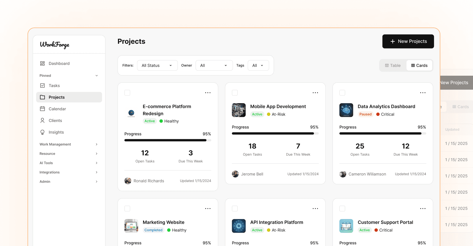
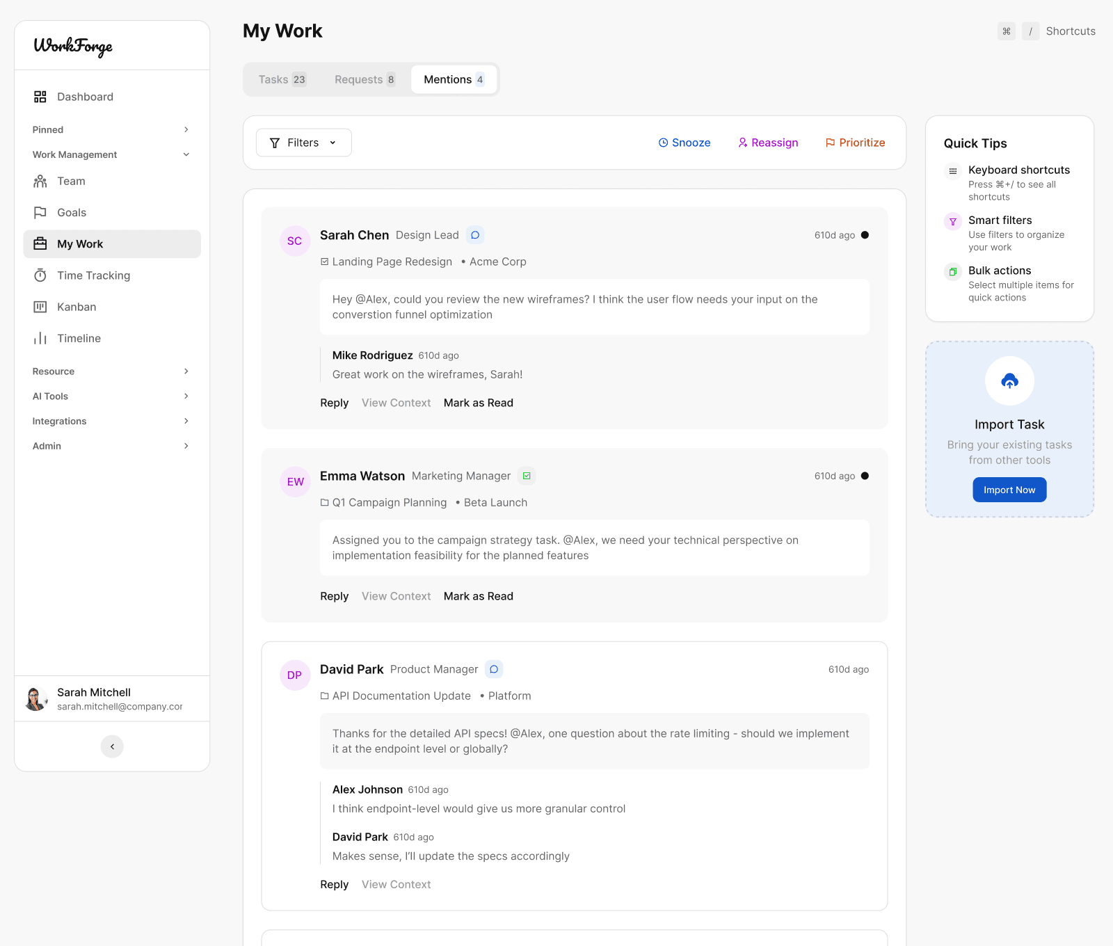
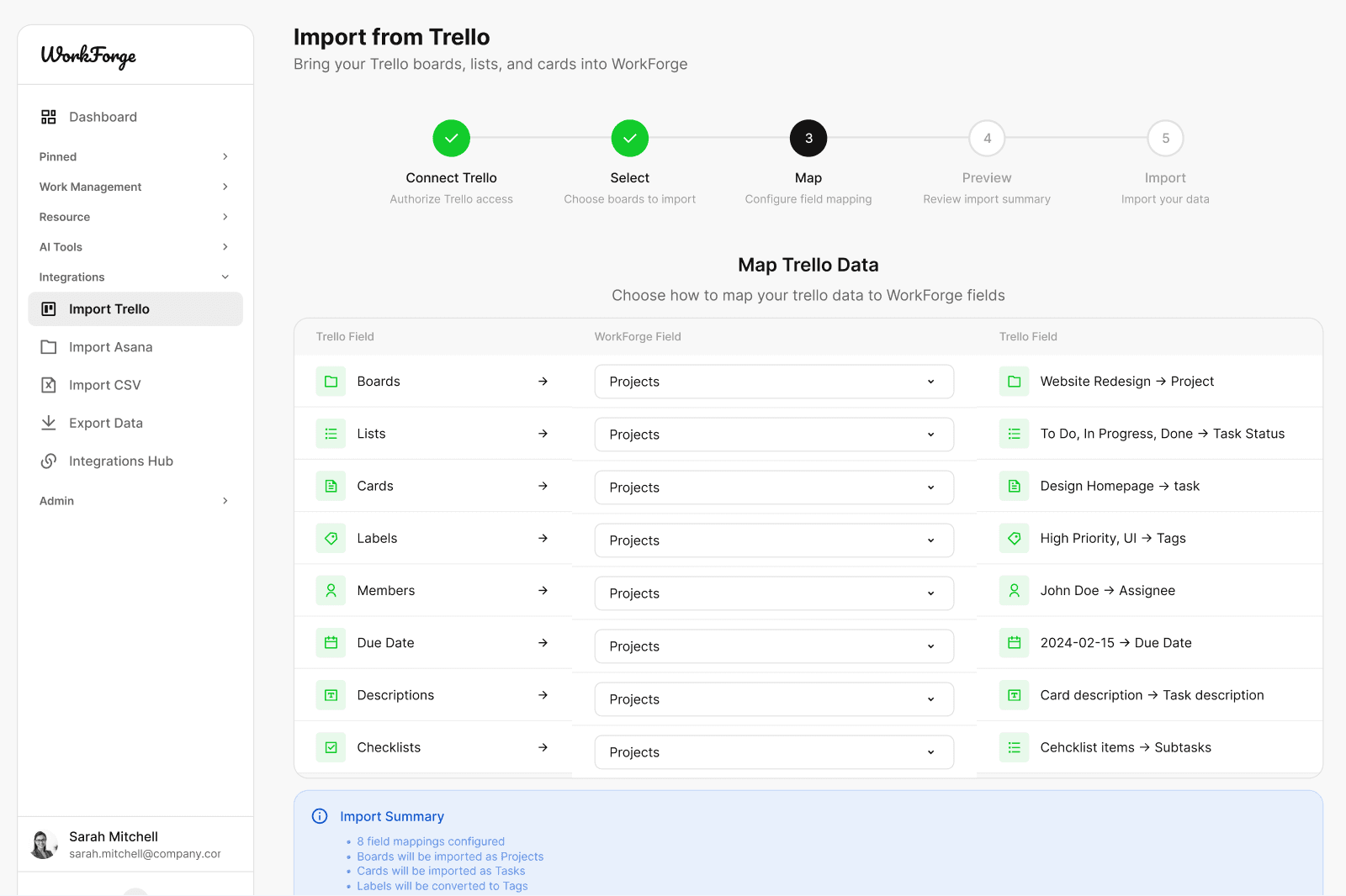
AI SaaS UI Kit – WorkForge
400+ AI SaaS screens for modern products
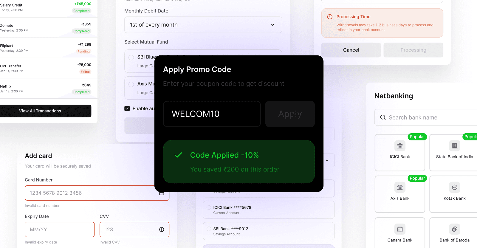
Fintech UI Kit – Finvo
600+ fintech screens for banking and payments
Payment Method Logicons
500+ payment brand icons for checkout flows
Tech Brand Logicons
500+ tech and SaaS brand icons
Earn 30% on Every Sale